Choosing the right colors for your living spaces can have a significant impact on your overall well-being and mental state. Colors can evoke different emotions and affect our moods in various ways.
When it comes to relaxation, certain colors have been proven to have a calming effect on our mind and body. In this article, we will explore which color promotes relaxation and how you can incorporate it into your surroundings.
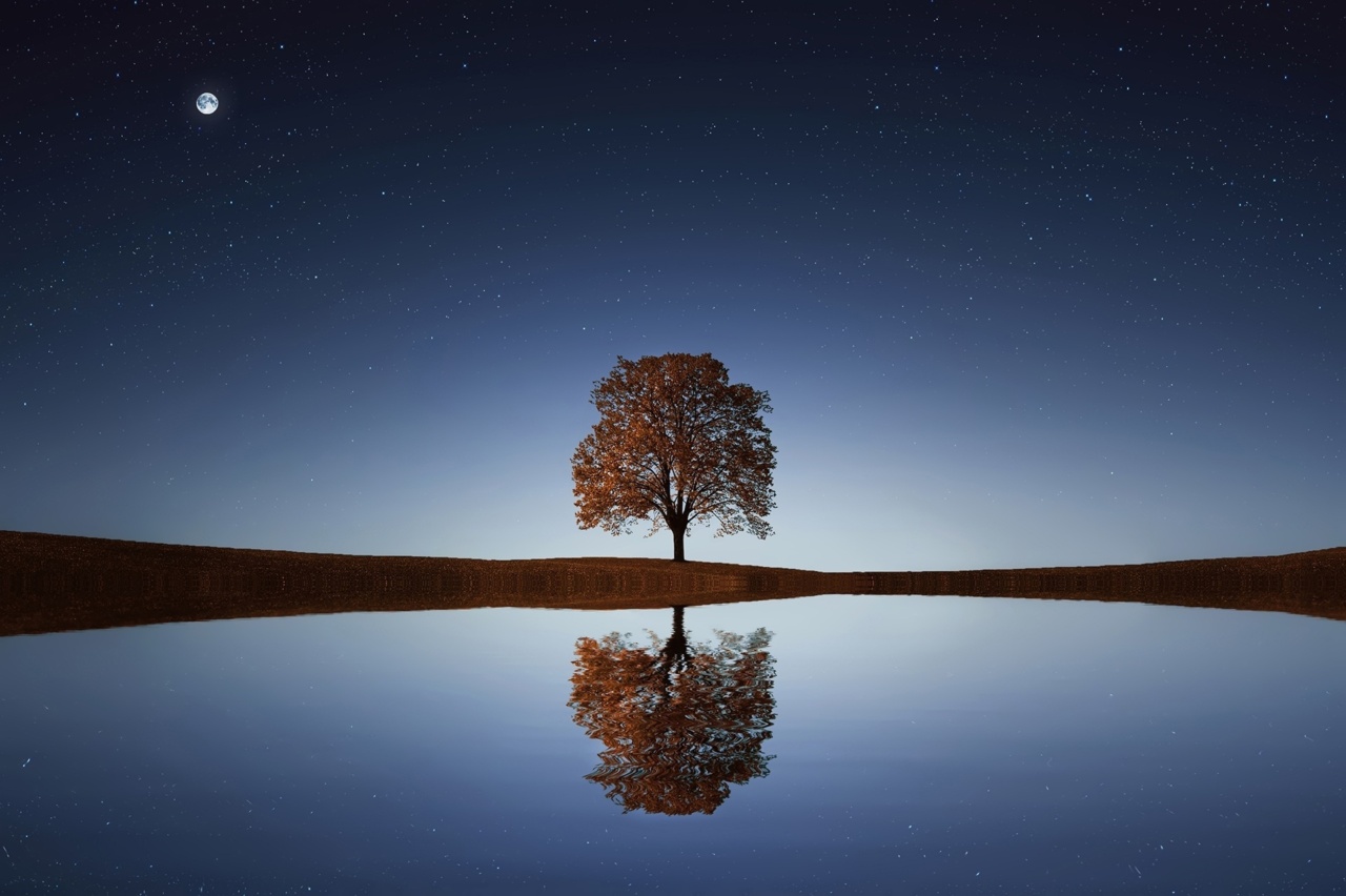
Blue: The Color of Serenity
One of the most universally recognized colors for promoting relaxation is blue. It is often associated with feelings of tranquility, calmness, and serenity.
Blue has a calming effect on the mind and is believed to slow down the heart rate and lower blood pressure. This color is particularly effective in bedrooms and bathrooms, where creating a serene atmosphere is essential for relaxation and quality sleep.
Green: The Color of Nature
Green is another color that promotes relaxation and has a soothing effect on our senses. It is often associated with nature and symbolizes growth, harmony, and balance.
Being surrounded by greenery or incorporating shades of green into your living spaces can help reduce stress and create a sense of calmness. Green is especially suitable for meditation rooms, offices, or areas where you want to evoke a feeling of tranquility.
Lavender: A Calming Shade
Lavender, a pale shade of purple, is known for its calming and therapeutic properties. It is often associated with relaxation, stress relief, and improved sleep quality.
Lavender has been used in aromatherapy for centuries to promote relaxation and induce a sense of tranquility. Incorporating lavender-colored elements or diffusing lavender essential oil in your space can help create a serene ambience and promote overall relaxation.
Gray: A Neutral Choice
Gray is a neutral color that can promote relaxation when used in the right shade. Light shades of gray, such as dove gray or silver gray, can create a calming and peaceful atmosphere. Gray is often associated with balance, stability, and neutrality.
It blends well with other colors and can be used as a base color to create a relaxing environment. However, it is important to avoid using dark or heavy shades of gray, as they can evoke feelings of sadness or melancholy.
White: The Ultimate Simplicity
White is often associated with purity, simplicity, and clarity. It can create a sense of spaciousness and openness, which can be relaxing for many people. White walls and furnishings can make a room feel clean, serene, and uncluttered.
However, it is important to use white in moderation and balance it with other colors to avoid creating a sterile or cold environment.
Pink: A Soft and Soothing Tone
Pink is a color often associated with femininity, tenderness, and nurturing. It has a calming effect on the mind and can promote relaxation and emotional well-being.
Related Article
Which color is best for relaxation?

Soft shades of pink, such as blush or pastel pink, can create a soothing and tranquil atmosphere. Pink is commonly used in bedrooms or spaces where relaxation and comfort are a priority.
Yellow: Energizing and Uplifting
While yellow is typically associated with energy and brightness, lighter shades of yellow can have a calming effect on the mind. Soft pastel yellows can create a warm and cozy atmosphere and uplift the mood.
Yellow can be used as an accent color in relaxation spaces to add a touch of vibrancy and positivity.
Beige: A Warm and Earthy Tone
Beige is a warm and earthy tone that promotes relaxation and comfort. It is often considered a neutral color and blends well with other shades.
Beige can create a cozy and inviting atmosphere, particularly in living rooms or areas where relaxation and socializing are encouraged. Pairing beige with natural elements like wood or plants can enhance its soothing qualities.
Brown: A Natural and Grounding Color
Brown, often associated with nature and earth, has a grounding effect on our emotions. It creates a sense of stability, security, and warmth. Lighter shades of brown, such as taupe or tan, can evoke feelings of relaxation and comfort.
Brown is commonly used in living rooms or spaces where a cozy and inviting ambiance is desired.
Purple: Calming and Spiritual
Purple is a color that is often associated with spirituality, introspection, and relaxation. Lighter shades of purple, such as lilac or lavender, can promote a sense of calmness and serenity.
Purple has been used in meditation practices for centuries and is believed to enhance spiritual well-being. Incorporating purple elements or fabrics in your space can create a tranquil and soothing environment.
Incorporating Relaxing Colors in Your Space
To incorporate relaxing colors in your living spaces, consider the following tips:.
- Choose a color scheme that includes one or more relaxing colors.
- Use relaxing colors for wall paint, furniture, and accessories.
- Add elements of nature, such as plants or nature-inspired artwork, to enhance the calming effect.
- Experiment with different shades and intensities of relaxing colors to find what works best for you.
- Balance relaxing colors with complementary or contrasting colors to create visual interest.
Remember that personal preferences play a crucial role in creating a relaxing environment. While certain colors have proven relaxation properties, it is essential to choose colors that resonate with you and make you feel calm and at ease.
Conclusion
Colors have the power to influence our emotions and state of mind. When it comes to promoting relaxation, certain colors have an inherent calming effect.
Blue, green, lavender, gray, white, pink, yellow, beige, brown, and purple are some of the colors that can create a serene and tranquil environment. By incorporating these colors into our living spaces, we can create an atmosphere conducive to relaxation and well-being.


